

About the Studio
IOTA Creative Studios is a small, independent studio that creates and looks after its own projects and brands.
We develop projects that are meant to last, clear in purpose, and careful about how they show up in the world. Rather than chasing trends or quick wins, IOTA emphasizes proud, lifelong ownership of the work we put out. Our projects include:
The studio takes its name from iota, the smallest letter in the Greek alphabet, often used to describe something small but meaningful. The circle (O) reflects the universal language of the arts. The Tau (T) is a minimalist cross adopted by the Order of Saint Francis and chosen for its simplicity and restraint. The triangle (A) represents three guiding principles behind every project: art, truth, and reputation, inspired by the classical ideas of rhetoric: pathos, logos, and ethos.
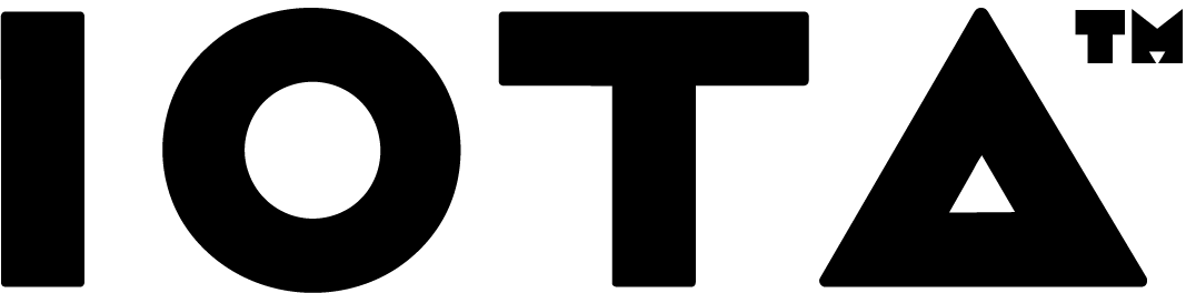
The brand’s color palette is intentionally limited to black and white. The black stands for truth. The white stands for beauty. Together, the mark is meant to be functional and steady rather than decorative, supporting the studio’s work without calling attention to itself.
The secondary logo just looks cool: